 Hide Table of Contents
 Tutorials
 About the API
 Work with the API
 Graphics and feature layers
 Popups and Info Windows
 Geoprocessor
 Operations Dashboard
 Create extensions
 Mobile
 ArcGIS Server Services
 References
 What's New archive
Info windows can be customized to have a different look and feel and behavior. For example, you may want the background of the info window to match your organization's Web site color scheme or have larger font-sizes or a different border color. You might also want to change the behavior of the info window, perhaps you want to create an info window that displays just the title and has an option to display additional content when clicked. Also refer to the Making your pop-up pop! blog post for additional tips on customizing the look and feel of a popup or info window.
Info windows can be customized by modifying the css, creating an image to use as the info window background or creating a custom info window.
Customize info window appearance using CSS
At version 2.2 and beyond you can use the standard out of the box info window or load the InfoWindowLite module using require() to display a simplified version of the info window.

You can customize the look of the lite info window by creating style rules. In this snippet, we apply a new border color and gradient background to the info window.
#map_infowindow.simpleInfoWindow {
    border: 2px solid #455268;
    background-color: #dfe5d7;
    background: -moz-linear-gradient(top, #fcfff4 0%, #dfe5d7 40%, #b3bead 100%);
    background: -webkit-gradient(linear, left top, left bottom, color-stop(0%,#fcfff4), color-stop(40%,#dfe5d7), color-stop(100%,#b3bead));
}
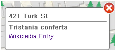
The resulting info window has a dark border color and a white-green gradient applied to the background.
Customize info window using an image
You can modify the look of the default info window by creating a png for the background, close button and pointer using a photo-editing program. Alternatively, you can download the png for the out of the box info window and modify the png using the photo editor of your choice.
After customizing the image, you can add a new css rule to your application to override the default image. In this snippet, we are overriding the default info window image for the popup:
.claro .infowindow .sprite {
   background-image: url('images/javainfowindow.png') !important;
}
Create a custom info window
The InfoWindowBase class, introduced at version 2.2, provides the ability to extend the info window to create a custom info window. To extend this class, you will need to provide an implementation for several required methods, properties and events to ensure that your custom window provides a minimum level of expected functionality. You can also define new methods, properties and events to enhance the info window. You can use this class to create info windows with custom appearance and behavior.
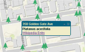
In this example, the content of the info window expands when you click the down arrow and the info window is hidden when the map is panned. To build a custom info window with this functionality, extend the InfoWindowBase class and add a new button to the title bar. When the user clicks the down button, the content portion of the info window is displayed using an animated effect defined using the dojo/fx/Toggler class.

After creating the custom info window, you can associate it with the map using the new infoWindow option:
var infoWindow = new myModules.InfoWindow({
  domNode: dojo.create("div", null, dojo.byId("map"))
});
map = new esri.Map("map", {
  extent: initExtent,
  infoWindow:infoWindow
});
View a sample that extends the InfoWindowBase class here.