PopupTemplate
require(["esri/PopupTemplate"], function(PopupTemplate) { /* code goes here */ });esri/PopupTemplateA PopupTemplate formats and defines the content of a Popup for a specific Layer or Graphic. A PopupTemplate allows the user to access values from feature attributes and values returned from Arcade expressions when a feature in the view is selected.
The PopupTemplate contains title and content properties that act as a template used to transform a feature's attributes into an HTML representation. The syntax {fieldName} or {expression/expressionName} performs parameter substitution. The default behavior on a Graphic is to show the view's Popup after a click on the Graphic. A PopupTemplate is required for this default behavior.
PopupTemplate also allows you to format the Number and Date field values and override field aliases with the fieldInfos property. Actions may also be added to the template to give users the ability to perform actions related to the feature, such as zooming to it or performing a Query based on the feature's location or attributes.
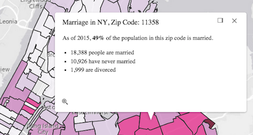
In the image above, the initial text Marriage in NY, Zip Code: 11358 is set in the title property of the PopupTemplate where ZIP is the name of the field containing zip codes.
popupTemplate.title = "Marriage in NY, Zip Code: {ZIP}",
The rest of the content is defined in the content property where NEVMARR_CY, MARRIED_CY, and DIVORCD_CY are all field names that contain values to be used in the popup.
popupTemplate.content = "<p>As of 2015, <b>{MARRIEDRATE}%</b> of the" +
" population in this zip code is married.</p>" +
"<ul><li>{MARRIED_CY} people are married</li>" +
"<li>{NEVMARR_CY} have never married</li>" +
"<li>{DIVORCD_CY} are divorced</li><ul>";
The above example demonstrates how to format the content directly with a custom text string. This is one way to format the template, it is also possible to add additional elements in the content such as fields, media, and attachments. These elements can be added individually or combined. More information on working with these various elements can be found in content.
PopupTemplates may also contain custom actions that, when clicked, execute custom code defined by the developer. See the actions property for more details.
- See also:
Constructors
- new PopupTemplate(properties)
- Parameter:properties Objectoptional
See the properties for a list of all the properties that may be passed into the constructor.
Property Overview
| Name | Type | Summary | Class | |
|---|---|---|---|---|
| Collection<(ActionButton|ActionToggle)> | A Collection of action or action toggle objects. more details | more details | PopupTemplate | |
| String | Object[] | Function | Promise | The template for defining and formatting a popup's content. more details | more details | PopupTemplate | |
| String | The name of the class. more details | more details | Accessor | |
| Object[] | An array of objects that reference Arcade expressions. more details | more details | PopupTemplate | |
| Object[] | An array of objects that defines how fields in the dataset or values from Arcade expressions participate in a popup. more details | more details | PopupTemplate | |
| Object | Additional options that can be defined for the popup layer. more details | more details | PopupTemplate | |
| String[] | An array of fields used in the PopupTemplate. more details | more details | PopupTemplate | |
| Boolean | Indicates whether actions should replace existing popup actions. more details | more details | PopupTemplate | |
| String | Function | The template for defining how to format the title used in a popup. more details | more details | PopupTemplate |
Property Details
- actionsautocastAutocasts from Object[]
A Collection of action or action toggle objects. Each object represents an action or function that may be executed by clicking the icon or image symbolizing them in the Popup. By default, every Popup has a
zoom-toaction styled with a magnifying glass icon . When this icon is clicked, the view zooms in four LODs and centers on the selected feature.
PopupTemplates do not have default actions. To override actions on the Popup using PopupTemplate see overwriteActions. Actions defined in a PopupTemplate will only appear in the Popup for features or layers that apply that particular PopupTemplate.
The order of each action in the popup is the same order in which they appear in the actions Collection.
The Popup event in Popup fires each time an action in the popup is clicked. This event should be used to execute custom code for each action clicked. For example, if you would like to add a
zoom-outaction to the PopupTemplate that zooms the view out several LODs, you would define the zoom-out code in a separate function. Then you would call the customzoom-outfunction in the trigger-action event handler. See the sample code snippet below for more details on how this works.Actions are defined with the properties listed in the ActionButton or ActionToggle class.
Example:// Defines an action to zoom out from the selected feature var zoomOutAction = { // This text is displayed as a tooltip title: "Zoom out", // The ID by which to reference the action in the event handler id: "zoom-out", // Sets the icon font used to style the action button className: "esri-icon-zoom-out-magnifying-glass" }; // Adds the custom action to the PopupTemplate. popupTemplate.actions.push(zoomOutAction); // Apply this PopupTemplate to a layer (or graphic) layer.popupTemplate = popupTemplate; // This action will only appear in the popup for features in that layer // The function to execute when the zoom-out action is clicked function zoomOut() { // In this case the view zooms out two LODs on each click view.goTo({ center: view.center, zoom: view.zoom - 2 }); } // This event fires for each click on any action // Notice this event is handled on the default popup of the View // NOT on an instance of PopupTemplate view.popup.on("trigger-action", function(event){ // If the zoom-out action is clicked, fire the zoomOut() function if(event.action.id === "zoom-out"){ zoomOut(); } });
The template for defining and formatting a popup's content. Content may be defined with one of four types of values.
- String - A popup's content can be a simple text or string value referencing field values or Arcade expressions. Expressions must be defined in the expressionInfos property. These values are referenced via placeholders. Within the string, placeholders are denoted by
{fieldName}or{expression/expressionName}which are used to specify which values from field attributes or expressions to display within certain locations in the string. When the application runs, substitution occurs and the placeholder is replaced with the actual attribute or expression value for the selected feature. The string can also include HTML markup and formatting functions. - Popup elements - You can also display content as popup elements defined as an array of Objects. These elements can be used individually or combined. The order in which they are set determines how they display within the popup. See the items below describing each element.
- text - Object that provides descriptive text as content. This object must be defined using the text popup element specification table.
- media - Array of objects used to display media such as charts and/or images. This object must be defined using the media popup element specification table.
- fields - Array of fieldInfos objects. If
fieldInfosis not set directly within thecontentproperty, the popup will display whatever is set in the PopupTemplate.fieldInfos property. This must be defined using the fields popup element specification table. - attachments - Array of attachmentInfos objects listed in the popup. This object must be defined using the attachments popup element specification table.
- promise - The PopupTemplate's content may also be defined with a promise that resolves to any of the above-mentioned elements. This is useful for cases when you run a task or execute a query and want to display the results in the popup. Simply pass the promise to the popupTemplate's content and ensure that it resolves to a string or other popup element.
- function - Content may be defined with a JavaScript function that returns any of the above-mentioned elements. This is handy when your popup requires additional processing or functionality than what is provided with the four content types listed above. For example, let’s assume that you would like to display charts using third-party JavaScript libraries or categorize information into separate tabs. In these cases, you can use a function that returns either a string, a reference to an HTML element, a popup element, or a promise. When the feature is clicked, the feature is passed as an argument to the function and provides access to the feature’s graphic and attributes. The function then executes and returns a value to display in the popup template. It is also possible to check a specific feature attribute and determine whether to apply a function based on its value. Out-of-the-box formatting functions can be used to format date, time, and number values. The syntax for using an out-of-the-box formatting function is:
{field-name:format-function-name(option-a: value, option-b: value)}
The formatter functions are described below:
Type Description DateString Formats the date into a human-readable format. Supports the following options: hideTime: false- Whentrueshows time. Default value isfalse.local: false- Displays date and time in the local time zone. Default value isfalse. Whenfalsethe date will display in UTC.systemLocale: false- Displays date and time in the system locale (local time zone). Default value isfalse.DateFormat Converts date fields into a human-readable format using dojo/date/locale.format method. Supports the same options as dojo/date/locale.format. The following snippets show some usage examples: {DATE_FIELD:DateFormat}produces3/8/08 4:00 PM.{DATE_FIELD:DateFormat(selector: 'date', fullYear: true)}produces4/8/2009.NumberFormat Formats numbers into various formats using the dojo/number.format method. Supports the same set of options as dojo/number.format. The following snippets show examples of usage pattern examples: {Magnitude:NumberFormat}produces4.23456.{Magnitude:NumberFormat(places:2)}produces4.23.Out-of-the-box formatting functions and custom functions are supported as of version 4.1.
- See also:
Examples:// Set a simple string to a popupTemplate's content // The string references a value from the POP_2015 attribute field layer.popupTemplate = { content: "{POP_2015} people live in this census tract" };// Set a simple string to a popupTemplate's content // referencing the value returned from an Arcade expression layer.popupTemplate = { content: "{expression/per-asian}% of the people in this tract are Asian." };// Display a table in the popup's content referencing two values // one from a field, and another returned from an Arcade expression layer.popupTemplate = { title: "Population in {NAME}", content: [{ type: "fields", fieldInfos: [{ fieldName: "POP_2015", label: "Total population (2015)", format: { digitSeparator: true } }, { fieldName: "expression/per-asian" }] }] };// The following snippet shows how to set various popup element types within the template's // content. This snippet also works with related tables. layer.popupTemplate.content = [{ type: "fields", fieldInfos: [{ fieldName: "Point_Count", visible: false, label: "Count of Points", format: { places: 0, digitSeparator: true } }, { fieldName: "relationships/0/Point_Count_COMMON", visible: true, label: "Sum of species tree count", format: { places: 0, digitSeparator: true }, statisticType: "sum" }] }, { type: "text", text: "There are {Point_Count} trees within census block {BLOCKCE10}" }, { type: "media", mediaInfos: [{ title: "<b>Count by type</b>", type: "pie-chart", caption: "", value: { theme: "Grasshopper", fields: [ "relationships/0/Point_Count_COMMON" ], normalizeField: null, tooltipField: "relationships/0/COMMON" } }, { title: "<b>Welcome to Beverly Hills</b>", type: "image", value: { sourceURL: "http://www.beverlyhills.org/cbhfiles/storage/files/13203374121770673849/122707_039r_final.jpg" } }] }, { type: "attachments" }];// The following snippet shows how to use function // to create a simple node and display it in the popup template content var template = new PopupTemplate({ title: "Population by Gender", content: setContentInfo }); function setContentInfo(feature){ // create a chart for example var node = domConstruct.create("div", { innerHTML: "Text Element inside an HTML div element." }); return node; }// The following snippet shows how to use a function on an attribute. // populationChange() function called on POP2013 attribute. // The snippet also shows the use of NumberFormat out of the box // formatter function on numeric field. var popupTemplate = new PopupTemplate({ title: "Population in {NAME}", content: "As of 2010, the population in this area was <b>{POP2010:NumberFormat}</b>." + "As of 2013, the population here was <b>{POP2013:NumberFormat}</b>." + "Percent change is {POP2013:populationChange}" }); populationChange = function (value, key, data) { // calculate the population percent change from 2010 to 2013. var diff = data.POP2013 - data.POP2010; var pctChange = (diff * 100) / data.POP2010; var result = diff > 0 ? "images/up.png" : "images/down.png"; // add green arrow if the percent change is positive. // red arrow for negative percent change. return "<img src='" + result + "'/>" + "<span style='color: " + (pctChange < 0 ? "red" : "green") + ";'>" + number.format(pctChange, { places: 3 }) + "%</span>"; }- String - A popup's content can be a simple text or string value referencing field values or Arcade expressions. Expressions must be defined in the expressionInfos property. These values are referenced via placeholders. Within the string, placeholders are denoted by
- Since: ArcGIS API for JavaScript 4.7
The name of the class. The declared class name is formatted as
esri.folder.className.
- expressionInfosObject[]Since: ArcGIS API for JavaScript 4.4
An array of objects that reference Arcade expressions. These expressions evaluate to either a number or a string value on a feature-by-feature basis at runtime. The values display within the view's popup as if they are field values. They can be displayed in a table using the
fieldInfosof the popupTemplate's content or referenced within a simple string. See the object specification table below for a description of the properties that may be set in each object.- Properties:
- name String
The name of the expression. This is used to reference the value of the given
expressionin the popupTemplate's content property by wrapping it in curly braces and prefacing it withexpression/(e.g.{expression/expressionName}). See the code snippets below for more examples.optionaltitle StringThe title used to describe the value returned by the expression in the popup. This will display if the value is referenced in a
fieldInfostable.expression StringAn Arcade expression evaluating to either a string or a number. This expression can reference field values using the
$featureglobal variable and perform mathematical calculations and logical evaluations at runtime.optionalreturnType StringIndicates the return type of the Arcade expression. This is an optional property.
Possible Values: string | number
Examples:// Displays two values returned from Arcade expressions // in a table within the popup when a feature is clicked layer.popupTemplate = { content: [{ type: "fields", fieldInfos: [{ fieldName: "expression/college" }, { fieldName: "expression/nocollege" }] }], expressionInfos: [{ name: "college", title: "Completed a college degree", expression: "$feature.bachelor + $feature.master + $feature.doctorate" }, { name: "nocollege", title: "Did not complete a college degree", expression: "$feature.elementary + $feature.middle + $feature.highschool + $feature.somecollege" }] };// Displays a value returned from an Arcade expression within // a simple string defined in the popupTemplate's content layer.popupTemplate = { content: "{expression/per-total}% of people in this boundary have a college education.", expressionInfos: [{ name: "per-total", expression: "Round((($feature.bachelor + $feature.master + $feature.doctorate) / $feature.TOT_POP) * 100, 2)" }] };
- fieldInfosObject[]
An array of objects that defines how fields in the dataset or values from Arcade expressions participate in a popup. Each object contains properties for a single field or expression. See the object specification table below for available options to set on each field.
- Properties:
- fieldName String
Required. The field name as defined by the service or the
nameof an Arcade expression. Arcade expression names are defined in the expressionInfos property. When referencing Arcade expressions, you must preface the name withexpression/, such asexpression/percent-total.optionalformat ObjectAn object used with numerical or date fields to provide more detail about how the value should be displayed in a popup. When formatting Number fields, you must set both the
digitSeparatorandplacesproperties for the formatting to take effect.- Specification:
- optionaldateFormat String
Used only with Date fields. Specifies how the date should appear in a popup.
Possible Values: short-date | short-date-le | long-date | day-short-month-year | long-month-day-year | short-date-long-time | short-date-le-long-time | short-date-short-time | short-date-le-short-time | short-date-short-time-24 | short-date-le-short-time-24 | short-date-short-time-24 | short-date-le-short-time-24 | long-month-year | short-month-year | yearoptionaldigitSeparator BooleanUsed only with Number fields. A value of
trueindicates the number should have a digit (or thousands) separator when the value appears in popups. A value offalsemeans that no separator will be used.optionalplaces NumberUsed only with Number fields to specify the number of supported decimal places that should appear in popups. Any places beyond this value are rounded.
optionallabel StringThe field alias to display in place of the
fieldNamein the popup.optionalstringFieldOption StringFor editable popups, defines the text box format.
Possible Values: rich-text | text-area | text-boxoptionaltooltip StringDefines a tooltip for editable popup fields.
optionalvisible BooleanDefines whether the field is visible in the popup.
Example:var popupTemplate = new PopupTemplate({ content: [{ type: "fields", fieldInfos: [{ fieldName: "ELEV_ft", label: "Elevation (feet)", format: { places: 0, digitSeparator: true } },{ fieldName: "PROMINENCE_ft", label: "Prominence (feet)", format: { places: 0, digitSeparator: true } },{ fieldName: "Recorded", label: "Recorded Date", format: { dateFormat: "short-date" } },{ fieldName: "expression/density" // label is defined in the expressionInfos }] }] });
- layerOptionsObjectSince: ArcGIS API for JavaScript 4.5
Additional options that can be defined for the popup layer. Currently supports one property,
showNoDataRecords.- Property:
- showNoDataRecords Boolean
Applicable to Imagery Layers. Indicates whether records without data should display within the popup.
- Default Value:null
Example:popupTemplate: { "title": "ScientificData/SeaTemperature:{ProductName}", content: [{ type: "fields", "fieldInfos": [{ "fieldName": "Raster.ItemPixelValue", "label": "Item Pixel Value", "isEditableOnLayer": false, "visible": true, "format": { "places": 2, "digitSeparator": true } }], "layerOptions": { "showNoDataRecords": true } }] }
- outFieldsString[]Since: ArcGIS API for JavaScript 4.9
An array of fields used in the PopupTemplate. Use this property to indicate what fields are required to fully render the PopupTemplate.
To fetch the values from all fields, use
["*"].- Default Value:null
- overwriteActionsBoolean
Indicates whether actions should replace existing popup actions.
- Default Value:false
Example:// The actions defined in the Popup will not display when the // PopupTemplate is used. The actions defined in the PopupTemplate will used instead. popupTemplate.overwriteActions = true;
The template for defining how to format the title used in a popup. You can format the title by specifying either a string value or a function that returns a simple string.
Example:// Within the popup template, placeholders are denoted by `{}`. // It specifies attributes to display. // In a service where a field named COUNTY_NAME contains the name of a county, the title // of the popup when the user clicks a feature representing Los Angeles County will say: // "Population in Los Angeles County" popupTemplate.title = "Population in {COUNTY_NAME} County";
Method Overview
| Name | Return Type | Summary | Class | |
|---|---|---|---|---|
| PopupTemplate | Creates a deep clone of the PopupTemplate object. more details | more details | clone | |
| * | Creates a new instance of this class and initializes it with values from a JSON object generated from a product in the ArcGIS platform. more details | more details | PopupTemplate | |
| Object | Converts an instance of this class to its ArcGIS portal JSON representation. more details | more details | PopupTemplate |
Method Details
Creates a deep clone of the PopupTemplate object.
Returns:Type Description PopupTemplate Returns a deep clone of the PopupTemplate.
- fromJSON(json){*}static
Creates a new instance of this class and initializes it with values from a JSON object generated from a product in the ArcGIS platform. The object passed into the input
jsonparameter often comes from a response to a query operation in the REST API or a toJSON() method from another ArcGIS product. See the Using fromJSON() topic in the Guide for details and examples of when and how to use this function.Parameter:json ObjectA JSON representation of the instance in the ArcGIS format. See the ArcGIS REST API documentation for examples of the structure of various input JSON objects.
Returns:Type Description * Returns a new instance of this class.
- toJSON(){Object}
Converts an instance of this class to its ArcGIS portal JSON representation. See the Using fromJSON() topic in the Guide for more information.
Returns:Type Description Object The ArcGIS portal JSON representation of an instance of this class.
Type Definitions
- attachmentsObject
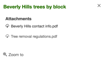
Attachments are a type of popup element. Similar to text and media elements, attachments can only be set within the content.
The object specification for the fields popup element is provided below.
- Property:
- type String
Required. The type of popup element to display. To list attachments, set this to
attachments. The attachmentInfos are queried from the service and will list within the popup.
Example:layer.popupTemplate.content = [{ type: "attachments" }];
- fieldsObject
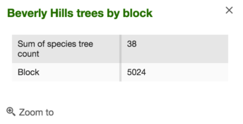
It is possible to set the fieldInfos directly within the PopupTemplate's content. If the fieldInfos is not set within the content, it will revert to whatever may be set within the PopupTemplate.fieldInfos property.
The object specification for the fields popup element is provided below.
- Properties:
- type String
Required. The type of popup element to display. To display tabular field data, set this to
fields.fieldInfos Object[]Object array of fieldInfos. If the
fieldInfosproperty is not provided directly within the content, the popup will display whatever is set directly in thePopupTemplate.fieldInfos.
Example:layer.popupTemplate.content = [{ type: "fields", fieldInfos: [{ fieldName: "Point_Count", visible: false, label: "Count of Points", format: { places: 0, digitSeparator: true } }, { fieldName: "relationships/0/Point_Count_COMMON", visible: true, label: "Sum of species tree count", format: { places: 0, digitSeparator: true }, statisticType: "sum" }] }];
- mediaObject
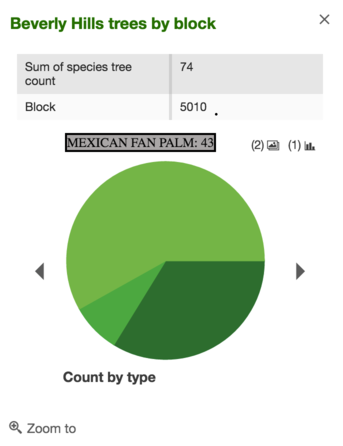
It is possible to set media elements such as charts and/or images within the PopupTemplate's content. This content is set within the mediaInfos.
The object specification for the media popup element is provided below.
- Properties:
- type String
Required. The type of popup element to display. To display charts or images, set this to
media.mediaInfos Object[]Required. Object array of mediaInfos representing images or charts for display.
- Properties:
- title String
Defines the media title.
caption StringDefines a caption for the media.
refreshInterval NumberSince: 4.5
Refresh interval of the layer in minutes. Non-zero value indicates automatic layer refresh at the specified interval. Value of0indicates auto refresh is not enabled. If the property does not exist, it is equivalent to having a value of0. Only applicable whentypeis set toimage.type StringDefines the media type.
Possible Values: image | pie-chart | bar-chart | column-chart | line-chartvalue ObjectDefines the value format. This depends on the media type.
- Specification:
- sourceURL String
Use this for image values. It defines the sourceURL pointing to the image.
fields String[]Used for chart values. An array of strings indicating field names from the specified layer.
normalizationField StringUsed for chart values. A field used to normalize data.
theme StringUsed for chart values. Defines a new dojo theme, only valid for chart types. View the Dojox Charting Theme Preview to see some of the theme options.
tooltipField StringUsed for chart values. Defines the tooltip display field that displays when hovering over the chart.
Example:layer.popupTemplate.content = [{ // The following creates a piechart in addition to an image. The chart is // also set up to work with related tables. type: "media", mediaInfos: [{ title: "<b>Count by type</b>", type: "pie-chart", caption: "", value: { theme: "Grasshopper", fields: ["relationships/0/Point_Count_COMMON"], normalizeField: null, tooltipField: "relationships/0/COMMON" } }, { title: "<b>Welcome to Beverly Hills</b>", type: "image", value: { sourceURL: "http://www.beverlyhills.org/cbhfiles/storage/files/13203374121770673849/122707_039r_final.jpg" } }] }];
- textObject
An object used to define descriptive text as an element within the PopupTemplate's content. The text may reference values returned from a field attribute or an Arcade expression.
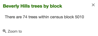
The object specification for the text popup element is provided below.
- Properties:
- type String
Required. The type of popup element to display. For descriptive text, set this to
text.text StringRequired. The formatted string content to display. This may contain a field name enclosed in
{}, such as{FIELDNAME}, or an Arcade expression name, referenced as{expression/EXPRESSIONNAME}. Text content may also leverage HTML tags such as<b></b>,<p></p>, and<table></table>for formatting the look and feel of the content. To use this element, set thetypeproperty totext.
Examples:layer.popupTemplate.content = [{ // This element uses an attribute from the featurelayer which displays a sentence //giving the total amount of trees value within a specified census block. type: "text", text: "There are {Point_Count} trees within census block {BLOCKCE10}" }];layer.popupTemplate = { content: [{ type: "text", text: "The {expression/predominance-tree} species occurs more often" + " than other tree species in the area." }] };
