ColorSlider
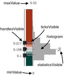
require(["esri/widgets/ColorSlider"], function(ColorSlider) { /* code goes here */ });esri/widgets/ColorSliderThe ColorSlider is a widget intended for authoring and exploring data-driven visualizations in a FeatureLayer or SceneLayer using color. To display properly, this slider requires a color visual variable and a statistics object. Other optional properties may be used, including adding a histogram. Most of the various options that affect the UI of the slider are labeled in the image below.
This slider has three events. The most commonly used event is likely the handle-value-change event. This is typically used to update the renderer when the user slides handles to new positions.
Constructors
- new ColorSlider(properties)
- Parameter:properties Objectoptional
See the properties for a list of all the properties that may be passed into the constructor.
Example:// Typical usage var slider = new ColorSlider({ statistics: stats, // object generated from summaryStatistics() visualVariable: colorVV, // color visual variable generated from a colorRendererCreator method }, "sliderDiv");
Property Overview
| Name | Type | Summary | Class | |
|---|---|---|---|---|
| String | HTMLElement | The ID or node representing the DOM element containing the widget. more details | more details | ColorSlider | |
| String | The name of the class. more details | more details | Accessor | |
| Boolean | Indicates whether to show the handles of the slider that may be dragged by the user. more details | more details | ColorSlider | |
| HistogramResult | The histogram associated with the data represented on the slider. more details | more details | ColorSlider | |
| Boolean | Indicates whether to show the histogram in the slider UI. more details | more details | ColorSlider | |
| Number | The width of the histogram in pixels. more details | more details | ColorSlider | |
| Boolean | Indicates whether to show labels in the slider UI. more details | more details | ColorSlider | |
| Number | The maximum value or upper bound of the slider. more details | more details | ColorSlider | |
| Number | The minimum value or lower bound of the slider. more details | more details | ColorSlider | |
| Number | Indicates the number of handles to show on the slider. more details | more details | ColorSlider | |
| Object | The summary statistics of the data represented in the slider. more details | more details | ColorSlider | |
| Boolean | Indicates whether to show the average in the slider UI. more details | more details | ColorSlider | |
| Boolean | Only applicable when numHandles is set to | more details | ColorSlider | |
| Boolean | Indicates whether to show tick marks next to the slider handles. more details | more details | ColorSlider | |
| Object[] | Each object in this array represents a stop in the color visual variable associated with the slider. more details | more details | ColorSlider | |
| Boolean | Indicates whether the widget is visible. more details | more details | ColorSlider | |
| ColorVisualVariable | The color visual variable represented by the slider. more details | more details | ColorSlider |
Property Details
The ID or node representing the DOM element containing the widget.
Note that once set, this property cannot be modified afterwards.
- Since: ArcGIS API for JavaScript 4.7
The name of the class. The declared class name is formatted as
esri.folder.className.
- handlesVisibleBoolean
Indicates whether to show the handles of the slider that may be dragged by the user. See the image in the class description to see where handles are typically placed.
- Default Value:true
- histogramHistogramResult
The histogram associated with the data represented on the slider. This may be generated using the histogram statistics function.
- See also:
Example:histogram({ layer: featureLayer, field: "fieldName" }).then(function(histogram){ // set the histogram to the slider slider.histogram = histogram; });
- histogramVisibleBoolean
Indicates whether to show the histogram in the slider UI. See the image in the class description to see where the histogram is typically placed.
- Default Value:true
- histogramWidthNumber
The width of the histogram in pixels.
- Default Value:100
- labelsVisibleBoolean
Indicates whether to show labels in the slider UI. See the image in the class description to see where labels are typically placed.
- Default Value:true
- maxValueNumber
The maximum value or upper bound of the slider. This value overrides the
maxproperty of the statistics, but may not be less than the value of the maximum stop of the color visual variable.This property may be set programmatically or by the user in the widget's UI.
Example:slider.maxValue = 150;
- minValueNumber
The minimum value or lower bound of the slider. This value overrides the
minproperty of the statistics, but may not be greater than the value of the minimum stop of the color visual variable.This property may be set programmatically or by the user in the widget's UI.
Example:slider.minValue = 0.15;
- numHandlesNumber
Indicates the number of handles to show on the slider. Acceptable values are
2or3. If3handles are specified, then the syncedHandles property may be enabled to sync the movement of the outside handles with the middle, or primary, handle.- Default Value:{"value":2,"set":""}
- statisticsObject
The summary statistics of the data represented in the slider. This is an object that may be generated from the summaryStatistics statistics function. The
minandmaxvalues in this object determine the minValue and maxValue of the slider if values for those properties are not already provided.- Properties:
- avg Number
The average of all data values represented in the color visual variable.
max NumberThe maximum of all data values represented in the color visual variable.
min NumberThe minimum of all data values represented in the color visual variable.
stddev NumberThe standard deviation calculated from all data values represented in the color visual variable.
Example:colorRendererCreator.createVisualVariable({ layer: featureLayer, field: "fieldName", basemap: map.basemap }).then(function(response){ // set the statistics to the slider slider.statistics = statistics; });
- statisticsVisibleBoolean
Indicates whether to show the average in the slider UI. See the image in the class description to see where this symbol is typically placed. Hover over this symbol to view the average in the tooltip.
- Default Value:true
- syncedHandlesBoolean
Only applicable when numHandles is set to
3. This property indicates whether the outside handles are synced with the middle, or primary, handle. If the primary handle is dragged then the outside handles are dragged while maintaining the same distance from the primary handle.- Default Value:false
- ticksVisibleBoolean
Indicates whether to show tick marks next to the slider handles. See the image in the class description to see where ticks are typically placed.
- Default Value:true
- valuesObject[]readonly
Each object in this array represents a stop in the color visual variable associated with the slider. The properties of each object describe whether the stop has a slider handle, the value of the handle and its associated color.
- visibleBoolean
Indicates whether the widget is visible.
- Default Value:true
Example:// Hides the widget in the view widget.visible = false;
- visualVariableColorVisualVariable
The color visual variable represented by the slider. This must be set initially on the slider for it to render in the view. This may be created manually (see snippet below) or generated from the colorRendererCreator helper methods. A new color visual variable is created each time the user slides handles or changes the minValue or the maxValue.
Example:slider.visualVariable = { type: "color", field: "count", stops: [ { value: 0, color: "#eee8d6" }, { value: 20, color: "#bcadda" }, { value: 40, color: "#9a85dd" }, { value: 60, color: "#7062b9" }, { value: 80, color: "#453e94" } ] };
Method Overview
| Name | Return Type | Summary | Class | |
|---|---|---|---|---|
Destroys the widget instance. more details | more details | ColorSlider | ||
| Object | Registers an event handler on the widget instance. more details | more details | ColorSlider |
Method Details
- destroy()
Destroys the widget instance. Call this method when the widget is no longer needed by the application.
Example:widget.destroy();
- on(type, listener){Object}
Registers an event handler on the widget instance. Call this method to hook an event with a listener. See the Events summary table for a list of supported events.
Parameters:type StringThe name of the event.
listener FunctionThe function to call when the event is fired.
Returns:Type Description Object Returns an event handler with a remove()method that can be called to stop listening for the event.Property Type Description remove Function When called, removes the listener from the event. - See also:
Example:slider.on("data-change", function (event){ var renderer = layer.renderer.clone(); renderer.visualVariables = [ lang.clone(slider.visualVariable) ]; layer.renderer = renderer; });
Event Overview
| Name | Type | Summary | Class | |
|---|---|---|---|---|
Fires on each handle value change (on slide) and change to the minValue or maxValue of the slider. more details | more details | ColorSlider | ||
Fires on each change to the minValue or maxValue of the slider. more details | more details | ColorSlider | ||
Fires when a handle value changes either by typing a new value or on slide end. more details | more details | ColorSlider |
Event Details
- data-change
- Example:
slider.on("data-change", function(){
  var renderer = layer.renderer.clone();
  renderer.visualVariables = [ slider.visualVariable ];
  layer.renderer = renderer;
});
- data-value-change
Fires on each change to the minValue or maxValue of the slider. This event is useful for updating the Legend when the upper and lower bounds of the stops are altered.
Example:slider.on("data-value-change", function(){ // execute your code here });
- handle-value-change
Fires when a handle value changes either by typing a new value or on slide end.
Example:slider.on("handle-value-change", function(){ // set the new visual variable on the renderer for immediate feedback var renderer = layer.renderer.clone(); renderer.visualVariables = [ slider.visualVariable ]; layer.renderer = renderer; });