Popup
require(["esri/widgets/Popup"], function(Popup) { /* code goes here */ });esri/widgets/PopupThe popup widget allows users to view content from feature attributes. Popups enhance web applications by providing users with a simple way to interact with and view attributes in a layer. They play an important role in relaying information to the user, which improves the storytelling capabilities of the application.
All Views contain a default popup. This popup can display generic content, which is set in its title and content properties. When content is set directly on the Popup instance it is not tied to a specific feature or layer.
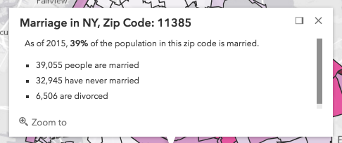
In the image above, the text "Marriage in NY, Zip Code: 11385" is the popup's title. The remaining text is its content. A dock button  may also be available in the top right corner of the popup. This allows the user to dock the popup to one of the sides or corners of the view. The options for docking may be set in the dockOptions property.
Popups can also contain actions that act like buttons, which execute a function defined by the developer when clicked. By default, every popup has a "Zoom in" action  that allows users to zoom to the selected feature. See the actions property for information about adding custom actions to a popup.
In most cases this module will not need to be loaded into your application because the view contains a default instance of popup.
PopupTemplate is closely related to Popup, but is more specific to layers and graphics. It allows you to define custom title and content templates based on the source of the selected feature. When a layer or a graphic has a defined PopupTemplate, the popup will display the content defined in the PopupTemplate when the feature is clicked. The content may contain field values from the attributes of the selected feature.
Custom PopupTemplates may also be assigned directly to a popup by setting graphics on the features property. For more information about Popup and how it relates to PopupTemplate see the samples listed below.
- See also:
Constructors
- new Popup(properties)
- Parameter:properties Objectoptional
See the properties for a list of all the properties that may be passed into the constructor.
Property Overview
| Name | Type | Summary | Class | |
|---|---|---|---|---|
| Collection<(ActionButton|ActionToggle)> | Defines actions that may be executed by clicking the icon or image symbolizing them in the popup. more details | more details | Popup | |
| String | Function | Position of the popup in relation to the selected feature. more details | more details | Popup | |
| Boolean | This closes the popup when the View camera or Viewpoint changes. more details | more details | Popup | |
| Boolean | Indicates whether the popup displays its content. more details | more details | Popup | |
| Boolean | Indicates whether to enable collapse functionality for the popup. more details | more details | Popup | |
| String | HTMLElement | The ID or node representing the DOM element containing the widget. more details | more details | Widget | |
| String | HTMLElement | Widget | The content of the popup. more details | more details | Popup | |
| String | Dock position in the View. more details | more details | Popup | |
| String | The name of the class. more details | more details | Accessor | |
| Boolean | When | more details | Widget | |
| Boolean | Indicates whether the placement of the popup is docked to the side of the view. more details | more details | Popup | |
| Object | Docking the popup allows for a better user experience, particularly when opening popups in apps on mobile devices. more details | more details | Popup | |
| Number | The number of selected features available to the popup. more details | more details | Popup | |
| Boolean | Shows pagination for the popup if available. more details | more details | Popup | |
| Graphic[] | An array of features associated with the popup. more details | more details | Popup | |
| GoToOverride | This function provides the ability to override either the MapView goTo() or SceneView goTo() methods. more details | more details | Popup | |
| Boolean | Highlight the selected popup feature using the highlightOptions set on the MapView or the highlightOptions set on the SceneView. more details | more details | Popup | |
| String | The unique ID assigned to the widget when the widget is created. more details | more details | Widget | |
| Point | Point used to position the popup. more details | more details | Popup | |
| Promise[] | An array of pending Promises that have not yet been fulfilled. more details | more details | Popup | |
| Graphic | The selected feature accessed by the popup. more details | more details | Popup | |
| Number | Index of the feature that is selected. more details | more details | Popup | |
| Boolean | Indicates whether to display a spinner at the popup location prior to its display when it has pending promises. more details | more details | Popup | |
| String | The title of the popup. more details | more details | Popup | |
| MapView | SceneView | A reference to the MapView or SceneView. more details | more details | Popup | |
| PopupViewModel | This is a class that contains all the logic (properties and methods) that controls this widget's behavior. more details | more details | Popup | |
| Boolean | Indicates whether the popup is visible. more details | more details | Popup |
Property Details
- actionsautocastAutocasts from Object[]
Defines actions that may be executed by clicking the icon or image symbolizing them in the popup. By default, every popup has a
zoom-toaction styled with a magnifying glass icon. When this icon is clicked, the view zooms in four LODs and centers on the selected feature.You may override this action by removing it from the
actionsarray or by setting the overwriteActions property totruein a PopupTemplate. The order of each action in the popup is the order in which they appear in the array.The trigger-action event fires each time an action in the popup is clicked. This event should be used to execute custom code for each action clicked. For example, if you would like to add a
zoom-outaction to the popup that zooms the view out several LODs, you would define the zoom-out code in a separate function. Then you would call the customzoom-outfunction in the trigger-action event handler. See the sample code snippet below for more details on how this works.Actions are defined with the properties listed in the ActionButton or ActionToggle classes.
Example:// Defines an action to zoom out from the selected feature var zoomOutAction = { // This text is displayed as a tooltip title: "Zoom out", // The ID by which to reference the action in the event handler id: "zoom-out", // Sets the icon font used to style the action button className: "esri-icon-zoom-out-magnifying-glass" }; // Adds the custom action to the popup. view.popup.actions.push(zoomOutAction); // The function to execute when the zoom-out action is clicked function zoomOut() { // in this case the view zooms out two LODs on each click view.goTo({ center: view.center, zoom: view.zoom - 2 }); } // This event fires for each click on any action view.popup.on("trigger-action", function(event){ // If the zoom-out action is clicked, fire the zoomOut() function if(event.action.id === "zoom-out"){ zoomOut(); } });
- Since: ArcGIS API for JavaScript 4.8
Position of the popup in relation to the selected feature.
Possible Values: auto | top-center | top-right | bottom-left | bottom-center | bottom-right | Function
- Default Value:"auto"
Example:// The popup will display to the left of the feature view.popup.alignment = "auto";
- autoCloseEnabledBooleanSince: ArcGIS API for JavaScript 4.5
- Default Value:false
- collapsedBooleanSince: ArcGIS API for JavaScript 4.5
Indicates whether the popup displays its content. If
true, only the header displays.- Default Value:false
- collapseEnabledBoolean
Indicates whether to enable collapse functionality for the popup.
- Default Value:true
The ID or node representing the DOM element containing the widget. This property can only be set once.
The content of the popup. When set directly on the Popup, this content is static and cannot use fields to set content templates. To set a template for the content based on field or attribute names, see PopupTemplate.content.
Example:// This sets generic instructions in the popup that will always be displayed // unless it is overridden by a PopupTemplate view.popup.content = "Click a feature on the map to view its attributes";
- currentDockPositionStringreadonly
Dock position in the View.
Possible Values: top-left | top-center | top-right | bottom-left | bottom-center | bottom-right
- Since: ArcGIS API for JavaScript 4.7
The name of the class. The declared class name is formatted as
esri.folder.className.
When
true, this property indicates whether the widget has been destroyed.
- dockEnabledBoolean
Indicates whether the placement of the popup is docked to the side of the view.
Docking the popup allows for a better user experience, particularly when opening popups in apps on mobile devices. When a popup is "dockEnabled" it means the popup no longer points to the selected feature or the location assigned to it. Rather it is attached to a side, the top, or the bottom of the view.
See dockOptions to override default options related to docking the popup.
- Default Value:false
- See also:
Example:// The popup will automatically be dockEnabled when made visible view.popup.dockEnabled = true;
- dockOptionsObject
Docking the popup allows for a better user experience, particularly when opening popups in apps on mobile devices. When a popup is "dockEnabled" it means the popup no longer points to the selected feature or the location assigned to it. Rather it is placed in one of the corners of the view or to the top or bottom of it. This property allows the developer to set various options for docking the popup.
See the object specification table below to override default docking properties on the popup.
- Properties:
optional Default Value:trueDefines the dimensions of the View at which to dock the popup. Set to
falseto disable docking at a breakpoint.optionalbuttonEnabled BooleanIf
true, displays the dock button. Iffalse, hides the dock button from the popup.optional Default Value:autoThe position in the view at which to dock the popup. Can be set as either a string or function. See the table below for known string values and their position in the view based on the view's size.
Known Value View size > breakpoint View size < breakpoint auto top-right bottom 100% top-left top-left top 100% top-center top-center top 100% top-right top-right top 100% bottom-left bottom-left bottom 100% bottom-center bottom-center bottom 100% bottom-right bottom-right bottom 100% - See also:
Example:view.popup.dockOptions = { // Disable the dock button so users cannot undock the popup buttonEnabled: false, // Dock the popup when the size of the view is less than or equal to 600x1000 pixels breakpoint: { width: 600, height: 1000 } };
Shows pagination for the popup if available. This allows the user to scroll through various selected features using either arrows
or a menu.
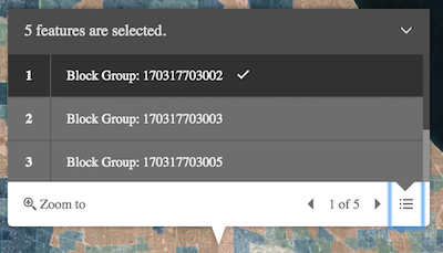
- featuresGraphic[]
An array of features associated with the popup. Each graphic in this array must have a valid PopupTemplate set. They may share the same PopupTemplate or have unique PopupTemplates depending on their attributes. The content and title of the popup is set based on the
contentandtitleproperties of each graphic's respective PopupTemplate.When more than one graphic exists in this array, the current content of the Popup is set based on the value of the selected feature.
This value is
nullif no features are associated with the popup.Example:// When setting the features property, the graphics pushed to this property // must have a PopupTemplate set. var g1 = new Graphic(); g1.popupTemplate = new PopupTemplate({ title: "Results title", content: "Results: {ATTRIBUTE_NAME}" }); // Set the graphics as an array to the popup instance. The content and title of // the popup will be set depending on the PopupTemplate of the graphics. // Each graphic may share the same PopupTemplate or have a unique PopupTemplate var graphics = [g1, g2, g3, g4, g5]; view.popup.features = graphics;
- goToOverrideSince: ArcGIS API for JavaScript 4.8
This function provides the ability to override either the MapView goTo() or SceneView goTo() methods.
Example:// The following snippet uses the Search widget but can be applied to any // widgets that support the goToOverride property. search.goToOverride = function(view, goToParams) { goToParams.options.duration = updatedDuration; return view.goTo(goToParams.target, goToParams.options); };
- highlightEnabledBoolean
Highlight the selected popup feature using the highlightOptions set on the MapView or the highlightOptions set on the SceneView.
- Default Value:true
The unique ID assigned to the widget when the widget is created. If not set by the developer, it will default to the container ID, or if that is not present then it will be automatically generated.
Point used to position the popup. This is automatically set when viewing the popup by selecting a feature. If using the Popup to display content not related to features in the map, such as the results from a task, then you must set this property before making the popup visible to the user.
- See also:
Examples:// Sets the location of the popup to the center of the view view.popup.location = view.center; // Displays the popup view.popup.visible = true;// Sets the location of the popup to a specific place (using autocast) // Note: using latlong only works if view is in Web Mercator or WGS84 spatial reference. view.popup.location = {latitude: 34.0571, longitude: -117.1968};// Sets the location of the popup to the location of a click on the view view.on("click", function(event){ view.popup.location = event.mapPoint; // Displays the popup view.popup.visible = true; });
- promisesPromise[]
An array of pending Promises that have not yet been fulfilled. If there are no pending promises, the value is
null. When the pending promises are resolved they are removed from this array and the features they return are pushed into the features array.
- selectedFeatureGraphicreadonly
The selected feature accessed by the popup. The content of the Popup is determined based on the PopupTemplate assigned to this feature.
- selectedFeatureIndexNumber
Index of the feature that is selected. When features are set, the first index is automatically selected.
- spinnerEnabledBoolean
Indicates whether to display a spinner at the popup location prior to its display when it has pending promises.
- titleString
The title of the popup. This can be set generically on the popup no matter the features that are selected. If the selected feature has a PopupTemplate, then the title set in the corresponding template is used here.
Example:// This title will display in the popup unless a selected feature's // PopupTemplate overrides it view.popup.title = "Population by zip codes in Southern California";
- viewModelautocast
This is a class that contains all the logic (properties and methods) that controls this widget's behavior. See the PopupViewModel class to access all properties and methods on the widget.
- visibleBoolean
Indicates whether the popup is visible.
Method Overview
| Name | Return Type | Summary | Class | |
|---|---|---|---|---|
Use this method to remove focus from the Widget. more details | more details | Popup | ||
| String | A utility method used for building the value for a widget's | more details | Widget | |
Removes promises, features, content, title and location from the Popup. more details | more details | Popup | ||
Closes the popup by setting its visible property to | more details | Popup | ||
Destroys the widget instance. more details | more details | Widget | ||
Emits an event on the instance. more details | more details | Popup | ||
Use this method to give focus to the Widget if the widget is able to be focused. more details | more details | Popup | ||
| Boolean | Indicates whether there is an event listener on the instance that matches the provided event name. more details | more details | Popup | |
| PopupViewModel | Selects the feature at the next index in relation to the selected feature. more details | more details | Popup | |
| Object | Registers an event handler on the instance. more details | more details | Popup | |
Opens the popup at the given location with content defined either explicitly with | more details | Popup | ||
Widget teardown helper. more details | more details | Widget | ||
This method is primarily used by developers when implementing custom widgets. more details | more details | Widget | ||
| PopupViewModel | Selects the feature at the previous index in relation to the selected feature. more details | more details | Popup | |
| Object | This method is primarily used by developers when implementing custom widgets. more details | more details | Widget | |
Renders widget to the DOM immediately. more details | more details | Widget | ||
Positions the popup on the view. more details | more details | Popup | ||
This method is primarily used by developers when implementing custom widgets. more details | more details | Widget | ||
| Popup | ||||
Deprecated. more details | more details | Widget | ||
Triggers the trigger-action event and executes the action at the specified index in the actions array. more details | more details | Popup |
Method Details
- blur()Since: ArcGIS API for JavaScript 4.6
Use this method to remove focus from the Widget.
- Since: ArcGIS API for JavaScript 4.7
A utility method used for building the value for a widget's
classproperty. This aids in simplifying CSS class setup.Prior to version 4.7, there were various approaches towards setting CSS classes. These were dependent upon variables, such as whether the classes were:
- a single static class,
- multiple static classes, or
- dynamic classes.
This helper method takes all of these approaches into account and simplifies it to use one single pattern to accommodate these multiple approaches.
Parameter:repeatable The class names.
Returns:Type Description String The computed class name. Example:// .tsx syntax showing how to set CSS classes while rendering the widget render() { const dynamicIconClasses = { [CSS.myIcon]: this.showIcon, [CSS.greyIcon]: !this.showIcon }; return ( <div class={classes(CSS.root, CSS.mixin, dynamicIconClasses)} /> ); }
- clear()
- close()
Closes the popup by setting its visible property to
false. Users can alternatively close the popup by directly setting the visible property tofalse.- See also:
- destroy()inherited
Destroys the widget instance.
- emit(type, event)Since: ArcGIS API for JavaScript 4.5
Emits an event on the instance. This method should only be used when creating subclasses of this class.
Parameters:type StringThe name of the event.
event ObjectThe event payload.
- focus()Since: ArcGIS API for JavaScript 4.6
Use this method to give focus to the Widget if the widget is able to be focused.
- hasEventListener(type){Boolean}
Indicates whether there is an event listener on the instance that matches the provided event name.
Parameter:type StringThe name of the event.
Returns:Type Description Boolean Returns true if the class supports the input event.
- next(){PopupViewModel}
Selects the feature at the next index in relation to the selected feature.
Returns:Type Description PopupViewModel Returns an instance of the popup's view model. - See also:
- on(type, listener){Object}
Registers an event handler on the instance. Call this method to hook an event with a listener.
Parameters:type StringThe name of event to listen for.
listener FunctionThe function to call when the event is fired.
Returns:Type Description Object Returns an event handler with a remove()method that can be called to stop listening for the event.Property Type Description remove Function When called, removes the listener from the event. - See also:
Example:view.on("click", function(event){ // event is the event handle returned after the event fires. console.log(event.mapPoint); });
- open(options)
Opens the popup at the given location with content defined either explicitly with
contentor driven from the PopupTemplate of input features. This method sets the popup's visible property totrue. Users can alternatively open the popup by directly setting the visible property totrue. The popup will only display if the view's size constraints in dockOptions are met or the location property is set to a geometry.Parameters:options ObjectoptionalDefines the location and content of the popup when opened.
Specification:title StringoptionalSets the title of the popup.
content String|HTMLElement|WidgetoptionalSets the the content of the popup.
location GeometryoptionalSets the popup's location, which is the geometry used to position the popup.
features Graphic[]optionalSets the popup's features, which populate the title and content of the popup based on each graphic's PopupTemplate.
promises Promise[]optionalSets pending promises on the popup. The popup will display once the promises resolve. Each promise must resolve to an array of Graphics.
featureMenuOpen BooleanoptionalDefault Value: falseSince: 4.5
This property enables multiple features in a popup to display in a list rather than displaying the first selected feature. Setting this totrueallows the user to scroll through the list of features returned from the query and choose the selection they want to display within the popup.updateLocationEnabled BooleanoptionalDefault Value: falseWhen
trueindicates the popup should update its location for each paginated feature based on the selected feature's geometry.collapsed BooleanoptionalDefault Value: falseSince: 4.5
Whentrue, indicates that only the popup header will display.Examples:view.on("click", function(event){ view.popup.open({ location: event.mapPoint, // location of the click on the view title: "You clicked here", // title displayed in the popup content: "This is a point of interest" // content displayed in the popup }); });view.popup.open({ title: "You clicked here", // title displayed in the popup content: "This is a point of interest", // content displayed in the popup updateLocationEnabled: true // updates the location of popup based on // selected feature's geometry });view.popup.open({ features: graphics, // array of graphics featureMenuOpen: true, // selected features initially display in a list });
- own(handles)inherited
Widget teardown helper. Any handles added to it will be automatically removed when the widget is destroyed.
Parameter:handles WatchHandle|WatchHandle[]Handles marked for removal once the widget is destroyed.
- postInitialize()inherited
This method is primarily used by developers when implementing custom widgets. Executes after widget is ready for rendering.
- previous(){PopupViewModel}
Selects the feature at the previous index in relation to the selected feature.
Returns:Type Description PopupViewModel Returns an instance of the popup's view model. - See also:
This method is primarily used by developers when implementing custom widgets. It must be implemented by subclasses for rendering.
Returns:Type Description Object The rendered virtual node.
- renderNow()inherited
Renders widget to the DOM immediately.
- reposition()
Positions the popup on the view. Moves the popup into the view's extent if the popup is partially or fully outside the view's extent.
If the popup is partially out of view, the view will move to fully show the popup. If the popup is fully out of view, the view will move to the popup's location.
- scheduleRender()inherited
This method is primarily used by developers when implementing custom widgets. Schedules widget rendering. This method is useful for changes affecting the UI.
- set()inner
- Deprecatedstartup()inherited
- since version 4.2.
Deprecated. Finalizes the creation of the widget.
- triggerAction(actionIndex)
Triggers the trigger-action event and executes the action at the specified index in the actions array.
Parameter:actionIndex NumberThe index of the action to execute.
Event Overview
| Name | Type | Summary | Class | |
|---|---|---|---|---|
{action: ActionButtonActionToggle} | Fires after the user clicks on an action or action toggle inside a popup. more details | more details | Popup |
Event Details
- trigger-action
Fires after the user clicks on an action or action toggle inside a popup. This event may be used to define a custom function to execute when particular actions are clicked. See the example below for details of how this works.
- Property:
- action ActionButton | ActionToggle
The action clicked by the user. For a description of this object and a specification of its properties, see the actions property of this class.
- See also:
Example:// Defines an action to zoom out from the selected feature var zoomOutAction = { // This text is displayed as a tooltip title: "Zoom out", // The ID used to reference this action in the event handler id: "zoom-out", // Sets the icon font used to style the action button className: "esri-icon-zoom-out-magnifying-glass" }; // Adds the custom action to the popup view.popup.actions.push(zoomOutAction); // Fires each time an action is clicked view.popup.on("trigger-action"), function(event){ // If the zoom-out action is clicked, than execute the following code if(event.action.id === "zoom-out"){ // Zoom out two levels (LODs) view.goTo({ center: view.center, zoom: view.zoom - 2 }); } });